
How to Customize Your Structured App
Looks matter. At least for an app that is designed to make your life a bit easier. This is why there are various settings that you can use to change the appearance of Structured to best fit your needs and preferences.
Customize Structured App
To access this realm of many possibilities, simply go to the ⚙️ Structured Settings and select Customization in the General section.
The top part of this section will now show you how the modifications you have chosen will change the look of your app. You can always switch between the timeline view and settings by using the tab bar at the bottom of the screen. This way, you can adjust your settings and check them in real time.

Layout
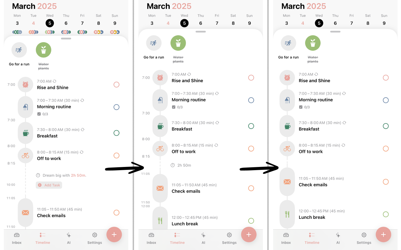
Choose between three types of layouts for your timeline, depending on whether you need suggestions to fill your gaps or want to keep it simple:
Full: In the default setting of the app, the time will be displayed on the left side of your tasks. In addition, you see the option to directly add a new task into a free time slot. Moreover, your tasks will be displayed as an icon below the date of each day.
Simplified: This mode gets rid of suggestions in free time slots. You can, of course, still add tasks with the ➕ symbol. Your timeline will appear less crowded. Moreover, your tasks won't be displayed as an icon below the date of each day anymore.
Minimal: Here, neither the free time slot suggestions will be displayed, nor the timestamp to the left of your tasks.
The option to simplify your layout may help you if you are having trouble focussing on too many things at once, or if you simply prefer a cleaner look.
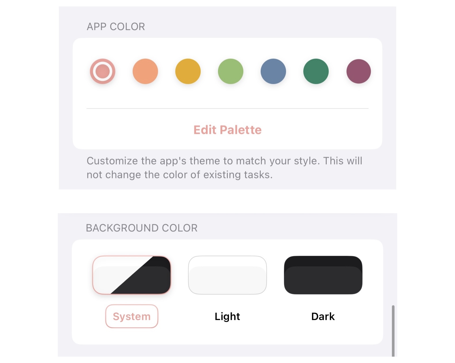
App Color & Background Color
With the App Color, you can customize the color scheme of Structured. Use either one of the most iconic Structured colors or create your very own custom colors. Please note that changing the app color will have no effect on the colors of your existing tasks.
There are also three options for the Background Color of the app. The default setting is System, which means that it is linked to the settings of your device (either bright or dark mode). If your phone goes into dark mode at a specific time, the same will happen in Structured. Alternatively, you can manually choose whether you want your app to stay in Light or Dark mode.
Font Size
On mobile devices, the font size of Structured is linked to your device's settings and can be changed there only.
On Apple devices, go to your general Settings app on your iPhone or iPad. In the Accessibility section, you can adjust your device's font size. Here, you can also increase contrast, reduce transparency, or reduce motion, which will affect the animations in Structured. This can be helpful if you struggle with motion sickness.
On Android devices, go to your general Settings app and select Display. Here, you can adjust the font size in the Font size and style section.
If you are using Structured on macOS, you can also adjust the font size in your ⚙️ Structured Settings. Tap Customization and scroll all the way down to Text Size. Use the slider to adjust the text size.
OpenDyslexic Font
In the Customization settings, you can change the System font to OpenDyslexic. This font was developed for people who struggle with dyslexia. You can learn more about OpenDyslexic here.
App Icon
If you are using Structured on iPhone or iPad, you can choose between a selection of different app icons. You can either select the default icon in a different color or, if you feel nostalgic, switch to an icon we used in a previous version of the app.
Please note that it is not possible yet to change the app icon or color on Structured for Mac or Android.
